

Source1
What the hell do you care about? Map it out. Tools and data (at the end) for mapping fascists!
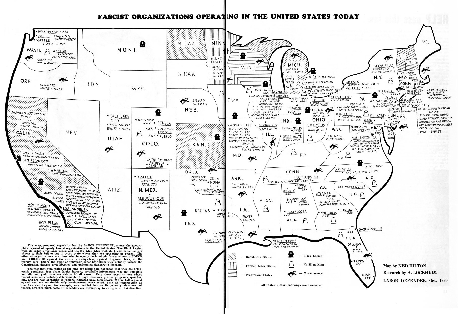
Murray Braun was way wound up about fascists in the U.S. in the mid-1930s. They were killing people! Thus, his map.
One guiding principle of Making Maps when the book was conceived was to include, as exemplars, interesting and relevant maps. The typical cartography text contains maps of certified boring topics like population, corn production, and GDP.2 The reason for this is likely twofold: those data sets are easy to get for the lazy textbook author and they stay well away from anything controversial. God forfend! One might, however, argue that maps of corn and other yawners in map-making textbooks do the reader a disservice.
Making Maps is not like other map and cartography texts. It is concise, is graphic (as befits the subject), focuses on the map making process, includes specific guidelines to help you design better maps, asks you to think, and shows maps that matter in the real world, engaged with conflict, human curiosity, politics, discovery, and controversy. (Making Maps, 4th Edition, “A Note to the Users of Making Maps,” p. 297)
On to the corn vs fascist issue.
Fascist! It’s not an old descriptor, taken from Mussolini’s anti-communist party partito nazionale fascista (1919). Facio is the core term, meaning group and association. While often used rather loosely as an insult, fascism describes a political preoccupation with decline, victimhood, grievance, nationalism, purity, control, rebirth, and so on.
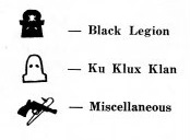
Murray Braun’s map of Fascist Organizations in America (1934) is one of a bunch of similar maps from the era, driven by left-leaning, labor-focused, typically socialist or communist types as well as African-American map-makers3. Mr. Braun tosses Fascists into two different major groups, the Black Legion and the Ku Klux Klan, along with a job-lot category of miscellaneous fascists.
The Black Legion, in their black frocks, splintered from the white-frocked KKK around 1925.4 It consisted largely of midwestern, white, working-class guys upset about migrants, the decline of American Values, etc., intent on imposing coarse Americanism via rag-tag militias and other loosely organized groups. They were remarkably violent bastards, responsible for around 50 deaths. The group faded out before WW2.
The other groups represented on the map include a robust collection of crusaders, vigilantes, patriots, defenders, pioneers, sentinels, and sundry angry Christian varietals.
The landscape and beliefs of these folks have not changed much since the 1930s, as shown in a selection of a few maps of Active Hate Groups used in Making Maps (4th ed.) in an exposition of the visual variable “shape” and what kind of data it best shows (qualitative, not quantitative differences).
How do you make shape interesting? Not with corn. I could have used major agricultural crop types (qualitative) and amount grown (quantitative). Another word for boring is soulless. Even if you care about corn, you don’t really feel anything about corn.5
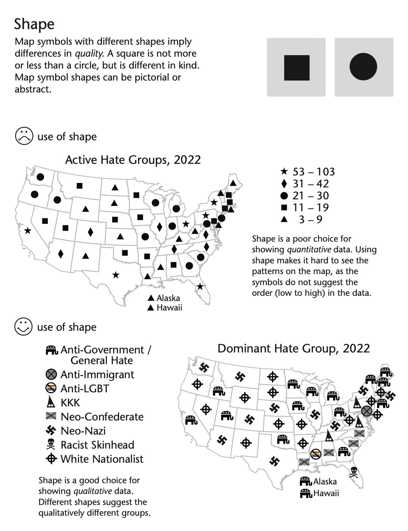
The source of data for this map is the Southern Poverty Law Center, itself accused of being a “left-wing smear factory” (Heritage Foundation) that has “weaponized its designation of 'hate group' to target conservative persons, organizations, and non-profits…”6 No one likes being called a hater, or fascist, I guess.
I did notice that the 2022 Hate Group data had a huge number of organizations that are part of the current U.S. Republican coalition, most in the “Anti-Government / General Hate” category. So maybe the cons are right. Or maybe they are, as the SPLC says, just a bunch of haters.
That’s the point of mapping Hate Group data in a book like Making Maps. Data is complex and interesting. It’s factual but also influenced by the way we create it, the categories we come up with, and the reason we are making the maps.
Maps and data are relevant to the things that get us wound up, either angry about hate groups and fascists, or angry at those who cast you as part of a hate group and a fascist. You just don’t get the same kind of visceral and intellectual response from corn. Visceral in that these are things that matter. Intellectual in that you can stop and think about what you are seeing: data selected and categorized by an organization that at its core has its ideological viewpoint, of groups of people with very different ideological viewpoints. Which should be the point with the maps in Making Maps. Dig in and think about them. About hate and poverty and sex and bad health care and on and on. Think about the data on the map, its sources, and the possibility of counter-mapping ….
What the hell do you care about? Map it out. Even if it’s corn. Actually, skip corn.
Keep thinking.
Project: Visualizing Hate Crimes and Hate Groups in the U.S.
Using publicly available hate crime and hate group data to create interactive maps that visualize spatial patterns, trends, and social correlations related to hate crimes and extremist groups in the U.S.
Tools & Platforms (Free/Online):
Tableau Public – creating interactive maps and dashboards.
Flourish – for simple, embeddable interactive maps.
QGIS – open-source GIS software for advanced mapping.
ArcGIS Online (Free Tier) – allows students to create web-based maps.
Google My Maps – basic mapping tool for plotting points and layers.
Data:
SPLC Hate Map – locations of hate groups across the U.S. Visit the SPLC Hate Map and click on "Download Data" to obtain the dataset.
FBI Hate Crime Statistics – hate crime incidents by state/city. Navigate to the FBI Crime Data Explorer and select "Hate Crime" to explore and download available datasets.
ADL H.E.A.T. Map – incidents of hate, extremism, and anti-Semitism. Access the ADL H.E.A.T. Map and use the "Download Data" option for datasets.
Kaggle – FBI Hate Crimes in USA (1991-2020) - FBI hate crime data over multiple years. Find the dataset on Kaggle. A free Kaggle account may be required to access the data.
U.S. Census Data – demographics (race, income, education) for context. Visit data.census.gov to explore and download datasets relevant to your analysis.
Project Tasks:
Data Collection & Cleaning:
Select at least two datasets (e.g., SPLC + FBI).
Perform basic data cleaning (e.g., location standardization, removing nulls) using Excel or Python.
Mapping & Visualization:
Plot hate crime incidents on a U.S. map using Tableau, Flourish, or Google My Maps.
Overlay demographic data (e.g., population density, racial demographics) to explore potential correlations.
Create heatmaps or choropleth maps to show intensity by region.
Analysis & Storytelling:
Analyze geographic patterns (e.g., Are hate crimes clustered in certain regions? Is there a correlation with demographics?).
Highlight notable patterns—for example, areas with high numbers of hate groups but low reported hate crimes, or vice versa.
Presentation & Narrative:
Build an interactive dashboard (Tableau Public or ArcGIS Online) or an interactive story map (e.g., ArcGIS StoryMaps).
Present findings, focusing on narrative storytelling—what does the data reveal? What are the limitations?
Extend the Project:
Temporal Analysis: Include a time dimension to show how hate crime patterns have evolved over time.
Policy Mapping: Overlay laws (e.g., states with/without hate crime laws) to see if there’s a correlation with reported incidents.
Social Context: Incorporate social events (e.g., election years, major protests) to analyze spikes in hate incidents.
Cop Crime: including databases that are being dissappeared by the current US administration (data still available at the BJS site, below). I tried to find some good cops databases, but one would have to find proxies for this (such as commendations, etc.; there is no aggregated data).
Outcomes:
Develop skills in data cleaning, geospatial mapping, and interactive visualization.
Gain experience in storytelling with data, emphasizing social impact.
Critically analyze ethical considerations in visualizing sensitive social issues, including claims that they are potentially “biased.” If these hate crime maps are “biased,” what would a “fair” (conservative-leaning) countermap consist of? What about skipping the skeevy politics and mapping love crimes instead?7
‘Fascist Organizations in America’ by Murray Braun from Class Struggle (C.L.S.). Vol. 4 Nos. 1, 2, & 3. January, February, & March, 1934.
“The mapping behind the movement: On recovering the critical cartographies of the African American Freedom Struggle,” by Derek H. Alderman, Joshua F.J. Inwood, and Ethan Bottone.
Ok, I realize I’m going off on corn here. It’s for effect. I swear I’m not an anticornite.
Angry Republican Man, https://oversight.house.gov/release/comer-probes-southern-poverty-law-centers-influence-over-federal-employees%EF%BF%BC/
Mutual Aid Hub, GLAAD Safe Spaces, Giving USA, National Association of Community and Restorative Justice. Damn, these are all left-wingy too.
Clearly too, too many fascists! An interesting map!