


Making Maps, 4th edition: Making a Book, Multivariate Maps, Map Design as Maps of Stuff that Matters
Fall 2023 Updates

I am sitting here at my local coffee office in Clintonville (Columbus), which has served as the site of labor on the new (4th) edition of Making Maps: A Visual Guide to Map Design (with Denis Wood). I am nearing completion of the first round of book revisions with a lot of cool updates - new data and maps and some cool theory stuff - all done up in InDesign via Illustrator and sometimes ArcGIS Pro. The only way a book with this much map and graphic and book design could get published is to do it on my own and pass along the files to my publisher. It’s actually an enjoyable effort.
Since the book (10” tall by 7” wide) consists of two-page spreads, I found a big weird binder (see above) and printed the two-page spreads as full pages (for review and editing). People love my big weird binder.
The publisher (Guilford) has been very supportive, as usual. Our editor, C Deborah Laughton, arranged for some great reviewers. We also had the insights of Nat Case (a fine cartographer and philosopher) and map savant Daniel Huffman (who helped me with some isoplethic maps, the weirdos in the group of map types - choropleth, graduated symbol, dot density - you can make with data in areas).
•••
A reviewer asked for a section on multivariate maps in the new edition of Making Maps. Seems fair. Should have thought of this before. This is why reviewers are a good idea.
I’ll admit I’ve never been the biggest fan of typical multivariate maps (particularly bi- and tri-variate choropleth maps) because they seem off-putting to most people: a jumble of colors that don’t inspire the viewer to take the time to figure them out. I know these kinds of maps are now part of ArcGIS Pro. Maybe that will make them more palatable.
Instead of the bi-variate choropleth maps, I went with something that is not so easy to just plug and play in software - Chernoff faces.
I was inspired by a favorite map, Gene Turner’s “Life in Los Angeles.” Turner’s map grabs the viewer’s attention (faces!) and that, it seems to me, inspires the viewer to dig a bit more into the multiple variables on display. I think some people got a bit nerfed about the use of the dark tone (race) on Turner’s map. Color can be controversial.

I think what makes Turner’s map work is that the faces were well designed. They were simpler than many Chernoff faces (which go all macho with dozens of facial components - including moles and other blemishes - all with fine data variations). They typically end up looking weird and complicated. I believe that with time, people can come to interpret data shown with those complicated multivariate faces, but first impressions are not great.
Turner classified his facial components and kept them simple: three classes for reach data variable, with four variables total. Nothing wrong with that. Indeed, I think Turner’s face design made the map - and the four variables - approachable.
•••
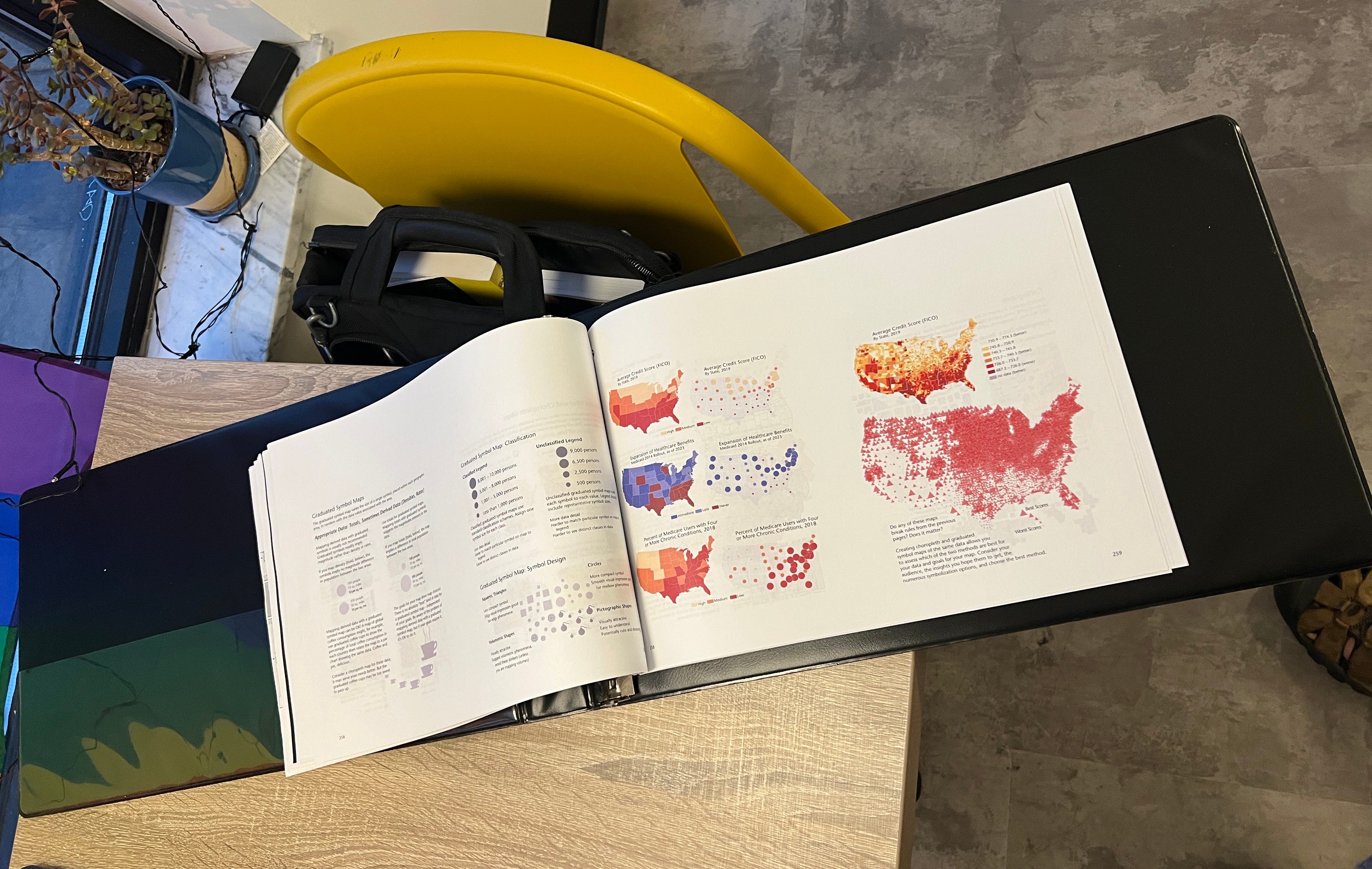
The four maps on the left of the two-page spread below (“Life in America”) are drawn from earlier in the chapter (on map abstraction and including the content on choropleth, graduated symbol, cartogram, dot density, and isopleth maps). Thus the book reader has seen these maps and data. In some cases, the data was by county, with more classes, in other cases by state (like these). The pedagogical point: look at the same data with different levels of generalization, classification, and symbolization.
The content has to be worthy. Boring content = bad map. This bunch of maps was inspired by “Why the South has Such Low Credit Scores,” by Andrew Van Dam. Andrew was kind enough to contact the folks with the credit score data, and they released it to me. The other data came from Van Dam’s article. In essence, a sad tale of intertwined horrors: low credit scores, failed Medicaid expansion, chronic illnesses, and, well, Trump. In some cases.

This map, if you look at it for a bit, is actually complicated. Thinking and discussion are required. It’s not just yellow and red. (PS: if you see something screwy, let me know. This is just a draft. I’m good at typos.)
I think the only qualm I had (briefly) was the colors chosen for the Trump data. Is it fair to make Trump-loving states increasingly red? Red is Republican. But it’s also stuff like danger, anger, high blood pressure, get a gun and shoot… And then, the assumption is that things like bad credit, bad healthcare, and bad health are bad (sunken cheeks, frowns, angry eyes). Screw it, these are all perfect map design choices.

I was teaching my intro Environment & Sustainability course last week and covered some material on environmental discourses. That made me think about a basic discourse approach to map design, which helps situate the map and its design:
The narrative: life’s kind of crappy in a spatially recognizable way in the US and it correlates to politics in some cases, and not others. Huh. Interesting.
The concept(s): financial and physical health and politics in the US
The ideology: “Belief in how the world is and how it ought to be.” All maps have this. They are political. If you fill a textbook with maps of corn production, temperature patterns (decontextualized from climate change), boring population maps, and so on, your politics is that maps should be boring. Blah. We avoid this in most cases for Making Maps. The examples in this chapter point out that a lot of people have crappy lives and crappy lives correlate with certain kinds of politics. I don’t think people should have crappy lives. Thus, that’s the ideology here.
Signifying Practices: The Chernoff faces. Because they seem to work, grab attention, and, possibly, make a typical viewer move beyond a single variable world into that is complex but understandable. If they are designed well. Maybe.
•••
I submitted this Chernoff map to the always cool Atlas of Design for next year’s volume. They asked for my definition of map design. There is no definition of map design in the three editions of Making Maps (nor is there a definition of a map after the 1st edition). This is purposeful; definitions are limiting. But sometimes useful. I popped out a definition of map design based on the discourse ideas above. I don’t expect this will make it into the next edition of Making Maps:
Map design is about crafting a visual discourse. This includes data, tools, projections, generalization, layout, color, type, and symbolization. Map design also means crafting the narrative, the supporting concepts and ideas, the ideology (maps are always political), and how the tangible design of the map serves these needs. Life in America is a collection of design choices (projection, color, symbol design, typography, etc.) and serves to illustrate exemplars (I hope) of such choices. Life in America is also designed with a broader message, suggesting the viewer consider the relationship between bad credit, inadequate healthcare, chronic health problems, and voting patterns.

Postscript: The Making Maps blog (makingmaps.net) is retired (but will remain in place). I have revived the brand, as it is, here at Substack. I can’t promise a regular, weekly newsletter but will occasionally post. While you can pay for a subscription, all newsletters here are freely available. Denis may also appear. I’ll also ponder revisiting some of my favorite postings from makingmaps.net and also ramble upon other mappish topics.
I apologize if you are now subscribed to Making Maps at Substack and did not want that! I exported the subscription list from makingmaps.net and imported it into Substack. I thought It would give me the option to send the subscribers an invite to subscribe to this new platform, but I believe it actually subscribed you. Should be easy to undo if you want.
Back soon with more ramblings on maps and an additional Substack on mapping and philosophy.
When you’re going big, I have found options at https://11x17.com.